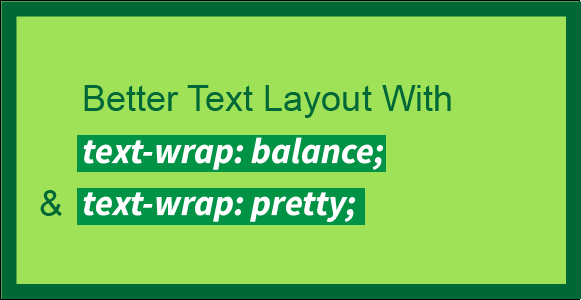
Better Text Layout with text-wrap: balance; and text-wrap: pretty;
Introduction
This article is meant to show you how you can improve your text layout with the new balance and pretty values for the text-wrap property. Both of these values prevent what can be termed design flaws. You use them because you want the benefit of text-wrap: wrap and also a better text layout. These property values are part of the CSS Text Module Level 4. We will begin with a review of text-wrap and the techniques used to control line breaks manually. Following that, we will learn about the new property values, which this article is about. We will learn how these values support us in inserting aesthetic line breaks in our text. After each property value is explained in this article, we will take a look at how they work under the hood, meaning how the browser implements them. We will briefly look at what we can do in terms of polyfills for these values and also discuss the stable value for text-wrap . In the end, we will review the full CSS form of text-wrap and take a look at the browser support charts.
What is the text-wrap property?
The text-wrap property can be set primarily as either wrap or nowrap on text to have it be wrapped or not be wrapped respectively.
- wrap
The text occupies multiple lines. This is the default text-wrap value. Text may form new lines based on the language. For example, forming lines in English based on spaces. It also follows other hints that we will discuss.
- nowrap
All of the text remains on a single line. It overflows its containing element if necessary, rather than breaking onto a new line.
If we choose to text-wrap: wrap; our text, it will be wrapped.
Friends of Known Content
After our text is wrapped, we may further want to control how it is wrapped on top of how text-wrap: wrap; wraps it. One reason for wanting this could be visual typography. For example, when our text is wrapped, it can be wrapped oddly. There may be one word left on the last line in a big block of text. Or one sole word on the second line in a two-line hero section heading or the headline of a blog post. In the case of a hero section heading, what we may want is the balancing of the headline among multiple lines each having the same or almost same amount of words. So, how do we control how our text is wrapped on top of how text-wrap: wrap; wraps it?
For a big block of text with one word on the last line, we can use es instead of normal spaces between the last two or three words, so that they would go to the last line.
In the case of a hero section heading of two lines with only one word on the second line, we can use the <br> tag to equally divide the text between the two lines. Doing so wouldn’t be responsive though. This means that you could get a worse typographic layout, because of the break tag, on different screen sizes. Same with using the es in the above example, that solution is not responsive either.
We have a few more friends. You can use the line break opportunity element <wbr> to let the browser know that it can also additionally break the line in the middle of a word if it wants. You can use the soft hyphen character ­ and the hyphens property to hyphenate at a specific point to break a line and even let the browser handle the hyphenation too.
There is one limitation though with all of the options that we have discussed so far. You can only get help from these friends if you are aware of the content itself such as in the case of a static HTML file. What if the content is not in your hands? Meaning that the content is dynamically added to the HTML file. For that up until a little before you had to use JavaScript to make such typographic layout improvements. Now there is a solution native in CSS that would be our friend for text from unknown content.
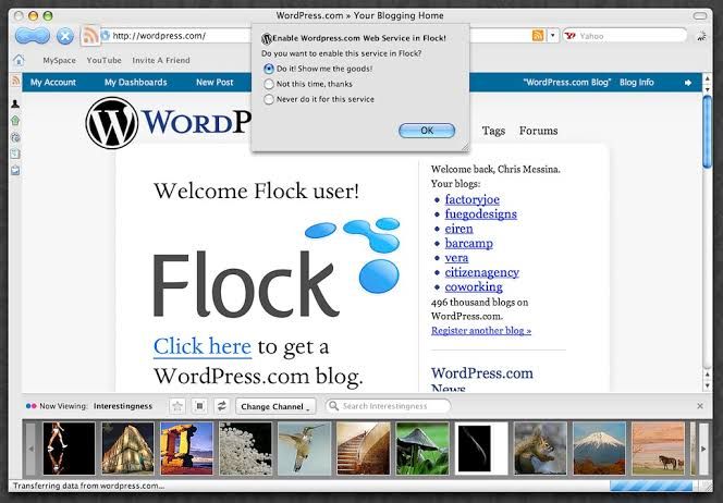
| *A blog made with the WordPress CMS is an example of a website with content dynamically inserted into HTML files | Source: Flickr* |
Friends of Unknown Content
Aside from the fact that our text may come from unknown content, there is another thing to consider. The websites that we make can be viewed on different screen sizes. The viewer may use the zooming option to change the font size. They may have a browser extension to switch the website between day and night mode. They may also right-click, select translate, and change the language of the website that we have made. Even though these aspects of browsing make the elements needed for the aesthetic treatment of the text of our websites variable, the browser also continues to give more options to the developer to put more nuance into the websites that we make. This time the browser has given us two new values for the text-wrap property. Let’s befriend two new friends so that they help us with our text from unknown content. Meet balance and pretty. Together, we came up with three limitations of our friends of known content:
- We have to know the actual text for them to work.
- They are not responsive.
- They do not hold up fully when the user uses the font and text customization features of the browser.
balance and pretty will help us with all three of these limitations.
The New Values
text-wrap: balance; — wraps text so that all lines are the same or almost the same amount of characters. It is like justified alignment in a way. This will help us get rid of the break tag from our hero section heading. Try commenting out the CSS rule text-wrap: balance in the demo below to see the difference.
Demo widget: https://codepen.io/shammadahmed/pen/azoQmEa
text-wrap: pretty; — avoids orphans, meaning that it makes sure that there are no one words on the last lines. This value will have more features, other than avoiding orphans, in the future. This will help us get rid of the es that we inserted among the last few words in our big block of text with only one word on the last line. Try commenting out the CSS rule text-wrap: pretty in the demo below to see the difference.
Demo widget: https://codepen.io/shammadahmed/pen/qEWQjdq
Using balance prevents orphans too, but goes further in making the multiple lines of text generally the same width. For the hero section heading problem that we discussed, using balance is perfect. Using pretty is more focused just on orphan prevention alone, making it more appropriate for text for which you neither want equal-width lines nor orphans. The pretty value is expected to become even better in the future with new features such as being able to avoid rivers. Rivers are white space lines that you can trace very easily among words with your eyes in a block of text.
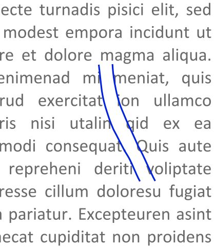
| *An example of a typographic river | Source (modified): Wikimedia Commons* |
Typography
Making headlines visually appealing and easy to read is a goal of designers. They do so to create a visual hierarchy on the page and catch the reader’s attention. Balancing text in typography goes back to the early days of printing when printers would hand-place letters. These days, designers have much more tools in their arsenals to balance text in their designs. You may have heard of kerning and read about metric versus optical alignment. Building on the traditions of designers from the print industry, text-wrap: balance; and text-wrap: pretty; bring the art of balancing text to the web in an automated way, though there is more to come. Especially with the pretty value. Check out this New York Times article on headline balancing.
Balancing the main article text is not common as it doesn’t need to stand out or catch the reader’s eye. You may use text-wrap: balance; on headings and subheadings to make them have equal or almost-equal width lines. You may use text-wrap: pretty; on paragraphs of text to get rid of orphans on the last line. The purpose of this tutorial is to show you how simple these property values are and how very simply you can add them both to your CSS to certain tags for better text layout. Let’s learn about these values in more detail.
Despite mostly Chromium-only support (browsers based on the Chromium browser engine), the use of these values would be a good candidate for progressive enhancement. It won’t negatively affect the experience if someone is not in a supported browser, but it will enhance the typography of the page for those in a supported browser.
text-wrap: balance
With text-wrap: balance;, text is wrapped in a way that best balances the number of characters on each line. Because counting characters and balancing them across multiple lines is computationally expensive, this value is only supported for blocks of text spanning a limited number of lines. This limit is six or fewer lines for Chromium, the browser engine behind Chrome and Edge and it is ten or less for Firefox. As browsers limit the number of lines impacted by this property, this value’s impact on performance is negligible. However, it should only be used on headlines, headings, subheadings, or small paragraphs. Applying it to large paragraphs will have no effect and comes at a performance cost because the browser is trying to calculate optimal balance even though it won’t apply anything.
// Not recommended
* {
 text-wrap: balance;
}
There are three powerful features of this value:
-
You don’t need to wait and time text wrap balancing with font loading, like you may need to do with a JavaScript solution. The browser takes care of it.
-
It will style languages with alternate writing directions such as right-to-left (Arabic, Persian, Urdu, etc) and vertical (Japanese) without any additional effort. Check out the demo below which uses Urdu, most commonly a right-to-left script language (it is also written using other scripts like Devanagari), for our hero section. Try commenting out the relevant CSS rule to see the text not be balanced.
Demo widget: https://codepen.io/shammadahmed/pen/wBwQVWw
- It is responsive meaning that our text can readjust its balancing when the screen size changes, to become balanced again. Use your browser developer tools to view the demo above in a different screen size to see how
balanceadapts for Urdu.
Applying this style may not provide you with the results you expect. It could be because the text needs to wrap and therefore have a maximum line length applied from somewhere. You may use
max-inline-size. It is likemax-widthbut can be set once for a particularwriting-mode.
Balancing won’t change the inline-size of the element
There’s an advantage to some of the JavaScript solutions for balanced text wrapping (which we will discuss in the polyfills section), as they change the max-width of the containing element itself. This has the bonus of the container being “shrink wrapped” to the balanced text block. On the other hand text-wrap: balance; can create a visual imbalance for the container, since the width of the container remains the same and the width of the text is reduced by being balanced. You can easily fix this by using width: fit-content.
.shrink-balanced {
 text-wrap: balance;
 width: fit-content;
}
balance and the white-space property
Balancing text clashes with the white-space property because one is asking for no wrapping and the other is asking for a kind of wrapping. You can overcome this by unsetting the white-space property. The text will remain balanced then.
.balanced-text {
 white-space: unset;
 text-wrap: balance;
}
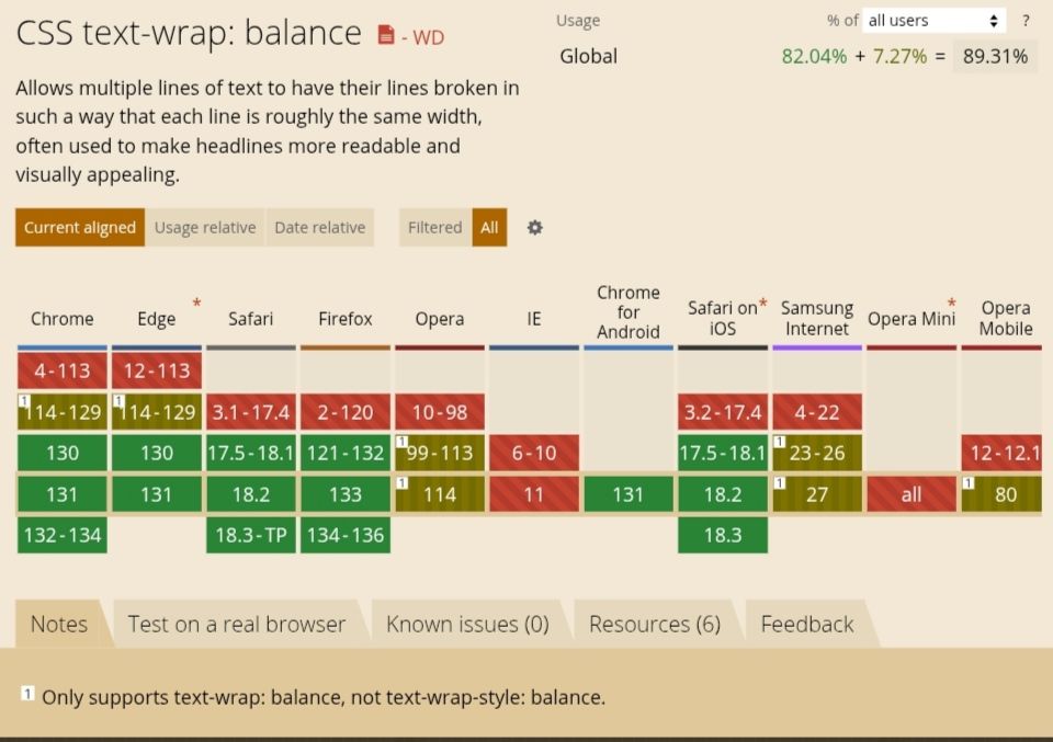
balance Browser Support
balance is supported in all majorly used browsers.
How does balance work under the hood (Based on Chrome sources)
There are two basic approaches when breaking text into lines.
- Line-by-line algorithms, also known as “greedy” algorithms. This algorithm is fast and is the default for all current browsers.
- Paragraph-level algorithms.
Both pretty and balance are paragraph-level line breaking, but they are designed for different purposes and produce different results. How balance works is that the browser effectively performs a binary search. It looks for the smallest width which doesn’t cause any additional lines, stopping at one CSS pixel (not equal to one display pixel). To further minimize steps in the binary search the browser starts with 80% of the average line width.
text-wrap: pretty
pretty is the opposite of balance in that it can be used on entire blocks of text. To balance between the typographic benefits and the performance impacts, it adjusts only the last four lines of a paragraph. The lines above the last four lines remain unchanged.
Using
prettyoften impacts performance, so it should be used for longer blocks of text when the layout is more important than speed.
Right now with the current implementation, pretty does a little more than simply avoiding orphans. According to the Chrome for Developers blog, pretty adjusts hyphenation if there are consecutive hyphenated lines at the end of a paragraph or adjusts previous lines to make room. It will also appropriately adjust for text justification.
pretty improves the overall line wrapping and text breaking in general. It is currently focused on avoiding orphans. In the future, text-wrap: pretty will provide more features like being able to avoid rivers, as we discussed earlier. pretty is also responsive like balance and will also style languages with alternate writing directions such as right-to-left (Arabic, Persian, Urdu, etc) and vertical (Japanese) without any additional effort, like balance. Check out our block of text example demo in the Urdu language below. Comment out the relevant CSS rule to see the difference. Also, use your browser developer tools to view the demo in a different screen size to see how pretty adapts for Urdu.
Demo widget: https://codepen.io/shammadahmed/pen/jENQgwr
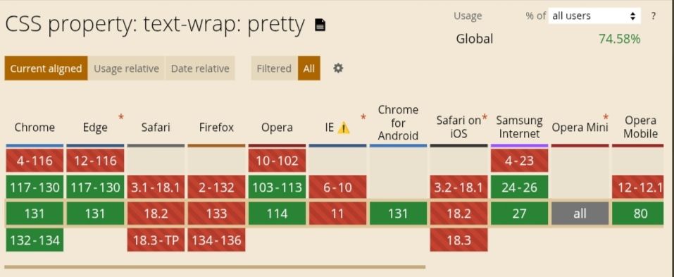
pretty Browser Support
pretty is only supported in Chrome and Edge.
Design Considerations
Widows are words alone at the top of a text block and orphans are words alone at the end of a text block.
prettyonly handles orphans, and not widows.
Note: text-wrap: pretty is different from CSS’s orphans property which is relevant when using CSS multi-column layout.
How does pretty work under the hood (Based on Chrome sources)
pretty uses “Score-based Paragraph-level Line Breaking”. Paragraph-level algorithms take other lines in the paragraph into consideration to achieve better typography. This type generally produces better typography, with the cost of performance. TeX is one of the most famous applications of this type of algorithm. Because paragraph-level algorithms are slow, there are multiple variants to mitigate the performance impacts.
Check out this GitHub issue.
The Algorithm
The current implementation of this algorithm used in Chromium is based on the Knuth-Plass algorithm used in TeX, and on the Android’s ‘optimal’ line breaker, which is applied when BREAK_STRATEGY_HIGH_QUALITY (the default value for TextView) is specified.
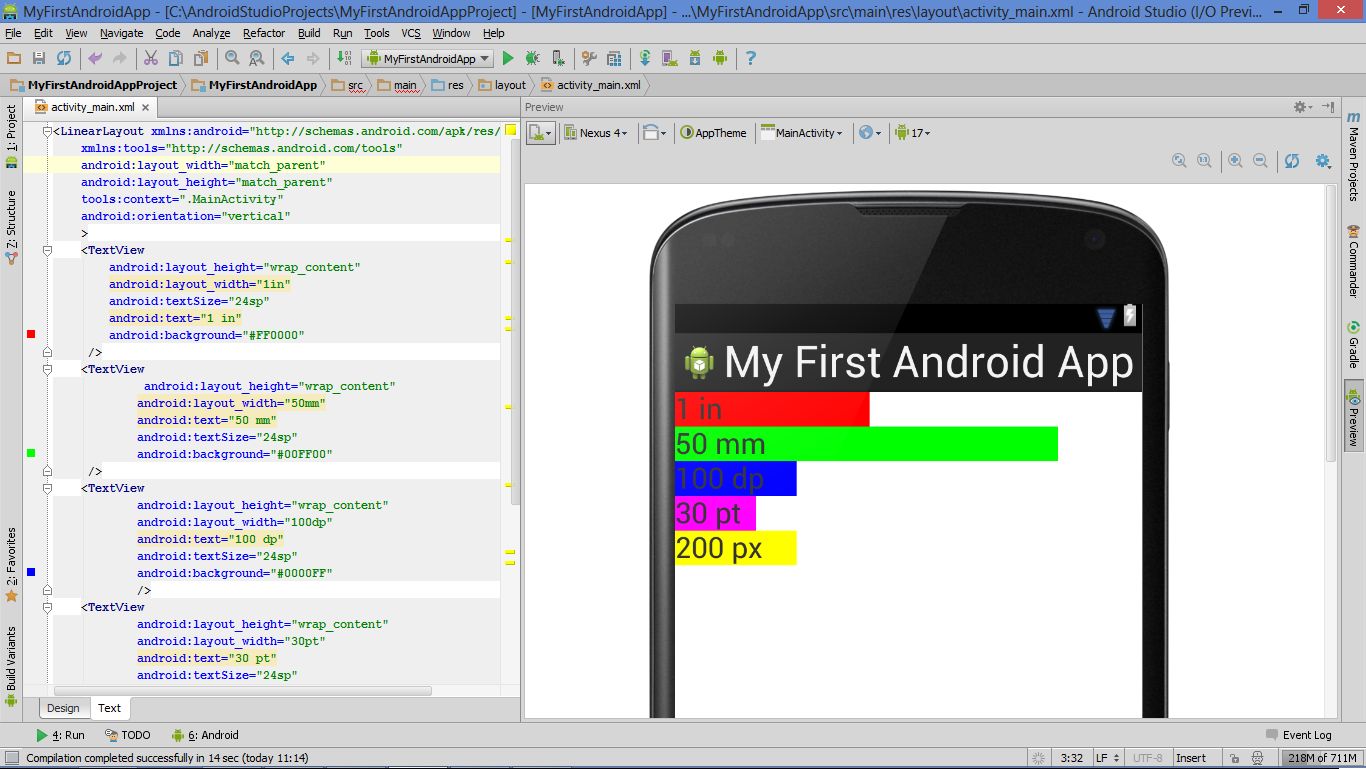
| *TextView is a basic UI element in Android that displays text and handles user interaction | Wikimedia Commons* |
In short, it works as follows:
- Compute all break candidates (that are break opportunities, the points where lines could break.)
- Determine the penalty of each break candidate.
- Compute the score for all possible combinations of break candidates.
- The final breakpoints are determined by the candidates with the best score.
Performance Considerations
While the text-wrap: pretty property is an opt-in to accept slower line breaking, it shouldn’t be too slow, or web developers can’t use them due to their performance restrictions. There are five performance considerations out of which one is not currently applied. Read the performance consideration heading in this document here: Score-based Paragraph-level Line Breaking
Polyfills
The JavaScript solution that has existed for a long time is Adobe’s BalanceText. Another is a React component called React Wrap Balancer. Both are polyfills only for balance and not for pretty. Check out GitHub for more solutions or write one on your own.
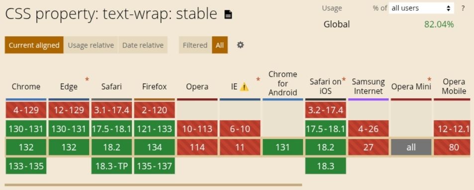
Honorable Mention: stable
The stable value improves user experience when text is contenteditable. This value provides wrap and makes sure that, as the user is editing text, only the next lines rewrap, meaning that the whole block of text does not rewrap which can confuse the user. The latter behavior, of the whole block rewrapping, would be the case with auto (text-wrap-mode: wrap; text-wrap-style: auto;). The behavior for all the three values that we have discussed in this article are otherwise equivalent to the value auto. Check out the demo on this MDN page, select the stable value from the list, and play around a bit with the stable value.
The Full CSS Form of text-wrap
There are 2 ways that text can flow across lines within a block of content. One is soft line breaks that the browser controls. The other is forced line breaks, that the user controls. The text-wrap property can be used to control soft line breaks.
text-wrap is the shorthand for two properties:
    text-wrap-mode
    text-wrap-style
Possible values that text-wrap-mode and text-wrap-style can have:
    /* Keyword values */
    text-wrap-mode: wrap;
    text-wrap-mode: nowrap;

    /* Global values */
    text-wrap-mode: inherit;
    text-wrap-mode: initial;
    text-wrap-mode: revert;
    text-wrap-mode: revert-layer;
    text-wrap-mode: unset;

    /********
    If "text-wrap-mode: wrap;" is selected, then "text-wrap-style" can be specified as a single value from the list below.
    ***********/

    /* Keyword values */
    text-wrap-style: auto;
    text-wrap-style: balance;
    text-wrap-style: pretty;
    text-wrap-style: stable;

    /* Global values */
    text-wrap-style: inherit;
    text-wrap-style: initial;
    text-wrap-style: revert;
    text-wrap-style: revert-layer;
    text-wrap-style: unset;
Note: The
white-space-collapseandtext-wrapproperties can be declared together using thewhite-spaceshorthand property.
Browser Support
Let’s look at the browser support charts from caniuse.com.
balanceis supported in all browsers.
prettyis only supported in Chrome and Edge.
stable
Conclusion
The underlying implementations of
balanceandprettythat we discussed in this article are paraphrased from Chrome sources.
We have explored the two new value additions to the text-wrap CSS property in depth and briefly reviewed text-wrap in general too. I hope that you enjoyed reading this article and are now confident in your knowledge to use the new value additions in your web development. Till then, happy coding!